Book Cover for JD Salinger’s famous book.
Artist Statement

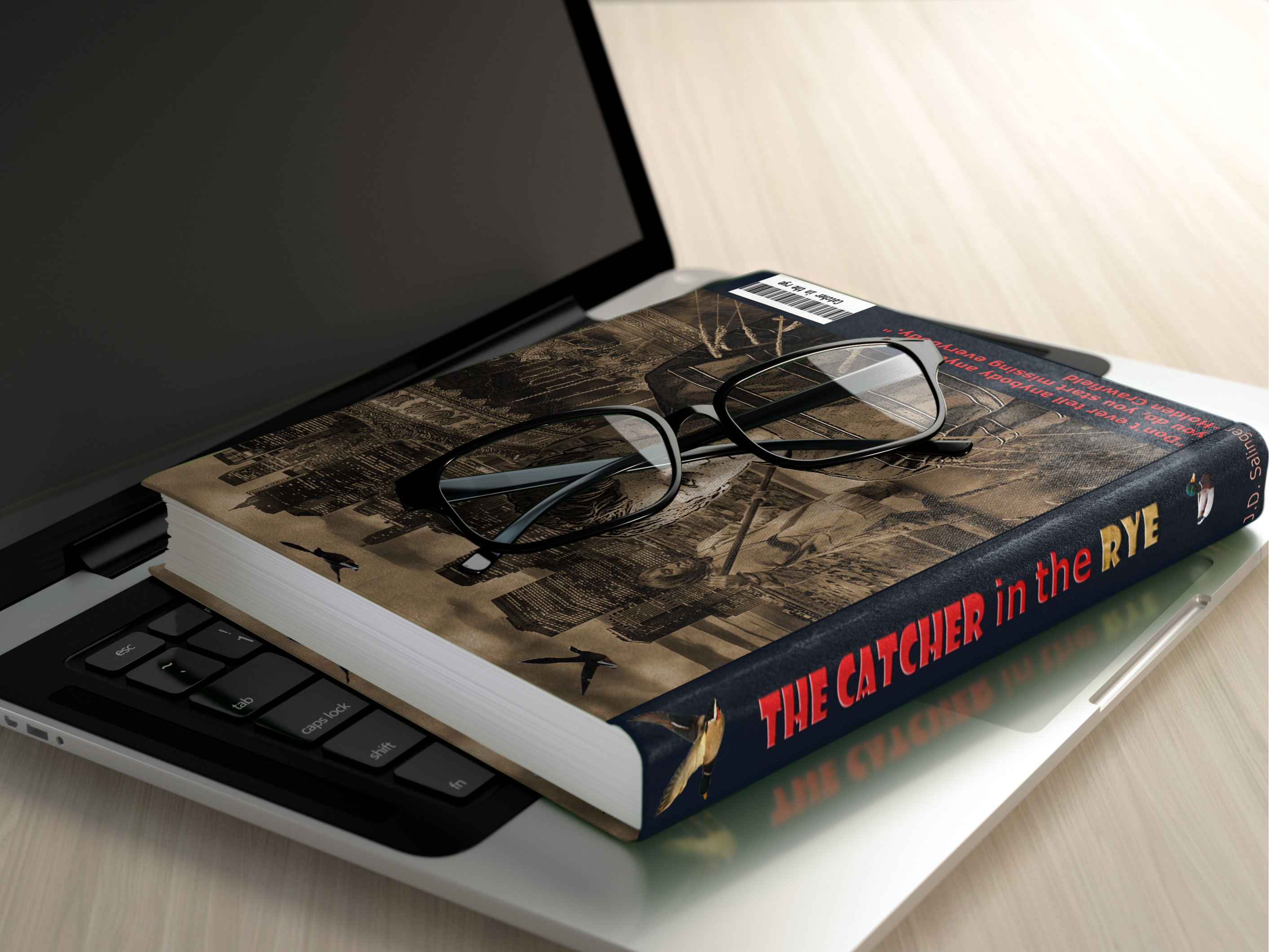
My book cover was “The Catcher in the Rye” By JD Salinger “. When I wrote my concept statement, I planned to use some typical images that are well-known about the story. I chose to work with my second sketch which depicts several symbols from the book; the first is the New York City skyline at the top with some ducks flying by. The story is based in New York and for some reason, Holden is obsessed with ducks and where they go for the winter. Below that is the title and then on the left is a carousel which is a very important part of the story. On the right was a boy, like Holden, with a red hat and he is standing in the field of rye.

When I came to the Photoshop version of my book cover design I realized that I wanted to do more than just the top cover of the book. I wanted to create a whole book cover with a front, back, spine and flaps. I believed it would look better in my portfolio. So I thought about the story some more and remembered how much Holden loved the Museum of Natural History. He loved it because nothing ever changes there and he is trying to deal with a lot of difficult changes in his life. He mentions the Eskimo and how it is always in the same spot spearing the fish. I luckily found an image of a museum Eskimo spearing a fish and it was a perfect addition to the back cover of the book.
My goal was to create my design while using the techniques that we were learning in class each week. Some of the techniques I used included layer, vector, clipping and channel masks, layer styles, adjustment layers, and filters. I used images from the school library as well as some of my own photographs. The channel and vector masks were new to me and it was fun learning more about them.
My final design is very similar to my original concept; only better. What I realized was that the boy standing in the rye field did not look right and the whole design was too scattered without a focal point. So I removed the image of the boy in the rye and made the bottom portion of the page the rye field. Then I found a better image of the boy. (My son Richard) I placed the image of Richard in the center of the front and back cover and used a filter called Poster Edges. It makes him look more like an illustration. Now the focus of the cover is the boy and the various images behind him are the things he does or thinks about. The addition of individual masked stalks of rye in the front, add depth and texture to the design.
I chose two fonts for the book title; Showcard Gothic and Verdana, with a clipping mask of a field of rye. For my color scheme, I started off with an interesting Sepia tone that gave the design a unique quality. But, then I looked at it in full color and I liked that look too. The instructor suggested that I use both and put the color version on the front and the sepia tone on the back. I really like using both styles.
There were some suggestions from my instructor and peers that I decided not to use. The first one was a suggestion that I put borders around the individual images to create a co
I believe my book cover is unified and successful. It presents imagery from the story as a single picture and it has rich colors and detail. I have included some images of the printed book to illustrate how nice it looks like a real book cover. I am happy with my final design and hope you agree.
ver like the Grand Theft Auto games. I tried to work that into the design, but it made it feel like a comic strip. The other suggestion was to switch the two images, to put the back cover on the front and the front on the back. I tried to make that change, but it did not work right. The two skylines are different and the title is harder to read over the back cover and the carousel was no longer in the center of the page, it was now on opposite sides. In order to make this change work, I would need to make more changes. As a result, I chose to leave the cover the way it was.